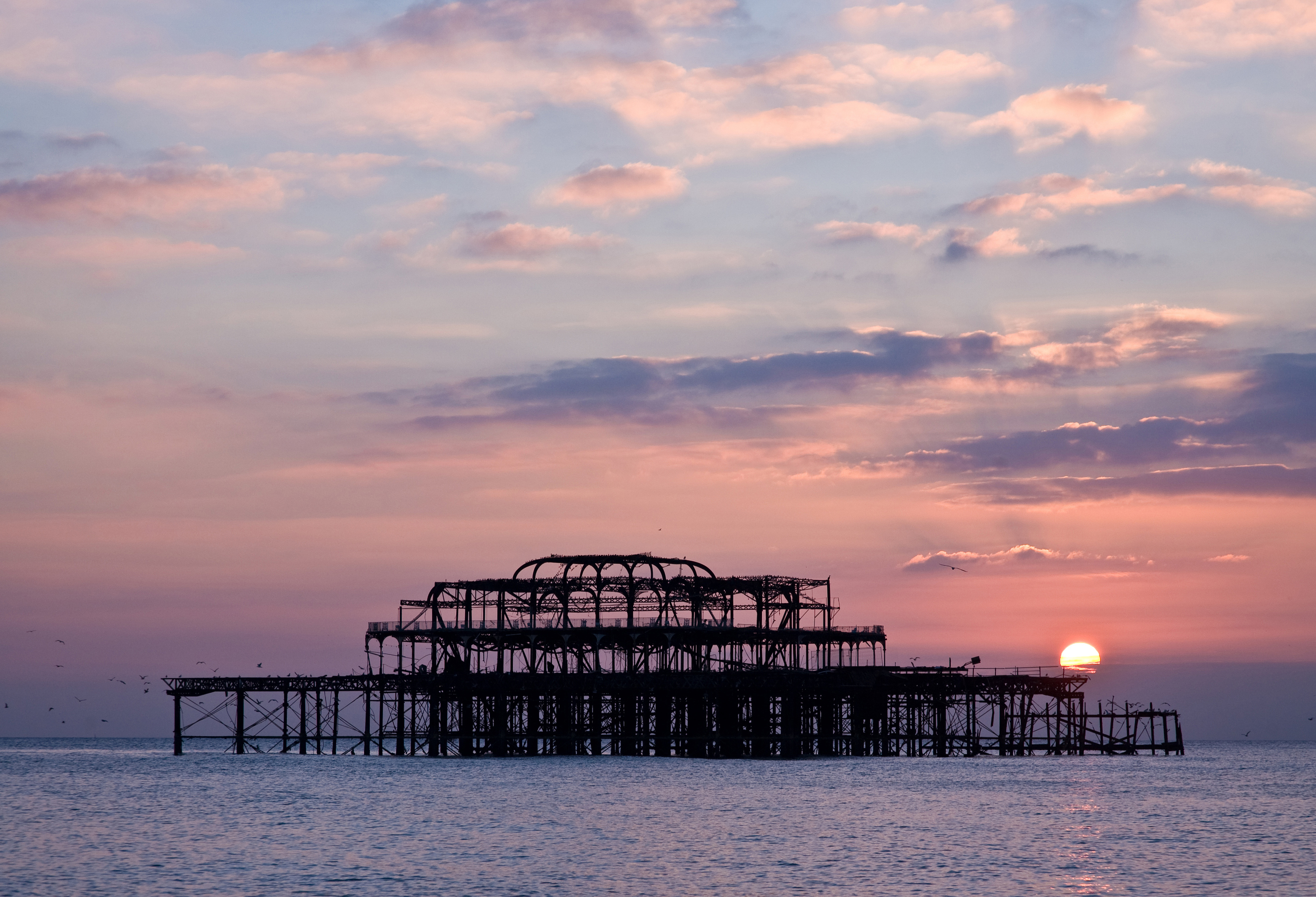
For BPKA the client has asked for something iconic of "Brighton" for the logo. The 4 main things that are Brighton all over are the Royal Pavillion, Brighton Pier, The burnt out West pier and Sea guls.
I think a circle design for a logo works well and I may take elements from these designs such as the type on a circled path. Lines to join up type at top and bottom.
Looking at these other academy logos it looks like a circle with some sort of imagery is used alot. I will consider this when producing the logo for BPKA
This simple logo for a Murray piano servies company uses the shape of keys to make the M for a great logo. I will try and incorporate the characteristics of pianos in my logo.